Cooking Up a New Brand Store for Growth

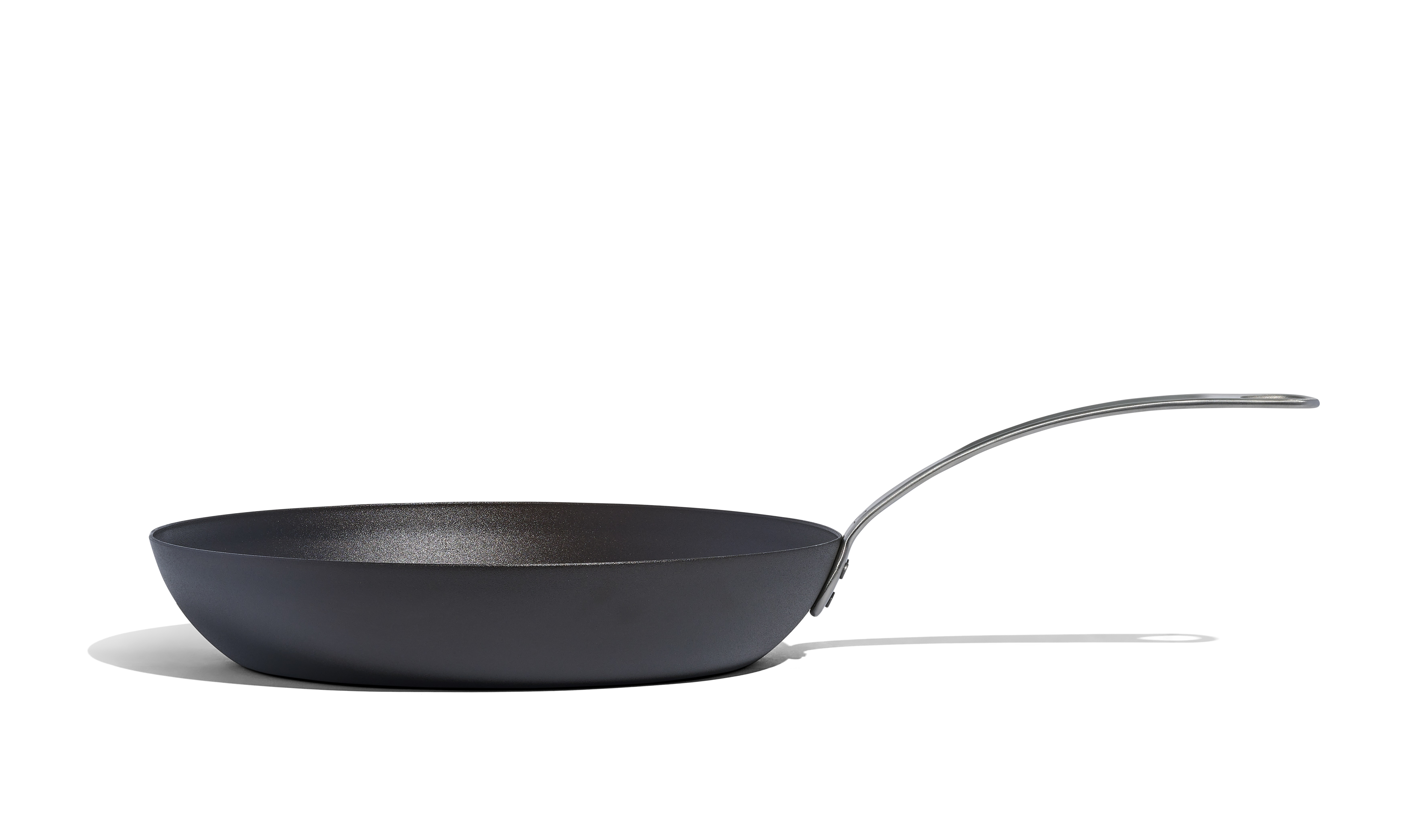
Made In Cookware, a premium kitchenware brand, aimed to elevate its Amazon presence through a comprehensive redesign of its brand store.
The goal was to align the store with the brand’s direct-to-consumer (DTC) website, improve user experience, and drive significant sales growth.
By focusing on user engagement, strategic product positioning, and enhanced navigation, Made In Cookware sought to increase both organic and sponsored traffic sales.
Challenges
1
2
3
4
Solutions
To address these challenges, Nectar implemented a strategic overhaul of Made In Cookware’s Amazon brand store, focusing on several key areas:
Above-the-Fold Improvements:
- Main Images and Infographics: One of the standout changes was the significant improvement of above-the-fold content. Nectar redesigned the main product images to better showcase the premium nature of Made In cookware. In addition, new infographics were introduced, visually communicating key features like material quality, durability, and product benefits. These images and infographics were placed in prime positions to capture attention immediately, ensuring that customers understood the value of the products without scrolling.
- Optimized Copy: In addition to visual improvements, Nectar optimized the above-the-fold copy to be concise and persuasive. Key product attributes, such as Made In’s durability and craftsmanship, were clearly outlined, making it easy for shoppers to grasp why these products stood out from competitors.
Visual and Brand Consistency:
- Building a Cohesive Brand Experience: The first step was to create a seamless transition between Made In’s DTC website and the Amazon brand store. By incorporating brand imagery, including engaging videos and clear value propositions, the store immediately captured the essence of Made In’s identity. This consistency helped reinforce brand trust and recognition, making it easier for customers familiar with the brand to navigate and purchase confidently.
- Highlighting Value Propositions: Nectar ensured that the brand’s core values and unique selling points were front and center. This included emphasizing Made In’s commitment to quality, craftsmanship, and innovation, which resonated well with discerning shoppers on Amazon.
Enhanced User Experience:
- Improving Shoppability: The redesign aimed to make the shopping experience as smooth and intuitive as possible. Nectar introduced easy navigation to subpages tailored to specific shopping needs, such as cookware sets or individual pieces. Each subpage was paired with relevant product blocks, allowing customers to quickly find what they were looking for and discover complementary items.
- Strategic Product Positioning: To increase the average market basket size, higher-priced items and complementary products were strategically positioned next to each other. This encouraged customers to consider additional purchases, driving up the overall value of their orders.
Optimized Navigation:
- Simplifying the Shopping Journey: One of the key improvements was the restructuring of the store’s navigation. Categories were split into smaller, more visually varied blocks, reducing the need for excessive scrolling and making it easier for customers to explore the full range of products. Top sellers were prominently displayed at the top of the home page, with quick add-to-cart options to streamline the purchase process.
- Mobile Optimization: Recognizing the importance of mobile shopping, Nectar ensured that the store was fully optimized for mobile users. This included faster load times, easy-to-click buttons, and a layout that was as functional on smartphones as it was on desktops.
Driving Engagement and Sales:
- Engaging Content: In addition to product positioning, the store featured lifestyle imagery and videos that not only showcased the products in use but also inspired customers by highlighting the possibilities of what they could achieve with Made In cookware.
- Seamless Checkout Process: The store was designed to reduce friction in the checkout process, ensuring that customers could easily add items to their cart and complete their purchase with minimal steps.
Results

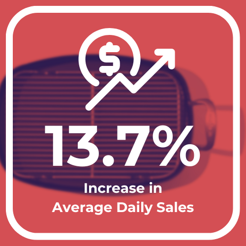
13.7% increase in average daily sales.
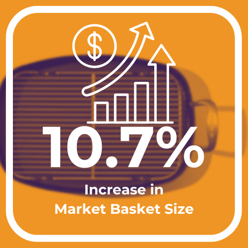
10.7% increase in the average market basket size—more items per order.
34.9% improvement in the sales-to-visitor ratio.
11.6% increase in organic traffic sales.
18.4% increase in sponsored brand traffic sales.
Before

After

.jpeg)

.jpeg)




.jpeg)
